Monday, July 30, 2012

My New Sanctuary: Room Tour


Once you walk into my room the book shelves are the first thing you see. Before, there were a lot more books. I threw out some of the kiddie books I had from when I was younger to make more room for the more age appropriate ones. It was such a mess before but this is super neat now. The door is a small storage closet. In there is board games, office supplies, lots of different papers. My mother shoved all that stuff in there.


Then you would walk past that through another walk way and my bed is there. While walking in you wouldn't see the front view of the bed though. This picture shows the front view of it. On it there are the 8-pc Comforter Set. I love it, its so cute. The artwork is also up there, as you can see. I love the touches of red. There is also the new headboard and I'm so happy with it. The assembly of it was fairly easy and it looks much neater than before.


At the foot of my bed you'd find my dress form, the inspiration for my whole room. I loved the colors of it so its what my whole new room look is based on. Next to it is my sewing machine in the box and my leftover fabric from Mood in the bag. I normally use the sewing machine at my desk (seen in the next picture).


Facing my bed is my dresser and desk. On my dresser there are cups and mugs from Broadway shows I've been too (excluding one, which was Wicked). There are six in total, from left to right is Ghost, Priscilla Queen of the Desert, Godspell, Wicked, Anything Goes, and Sister Act. I also have a small mirror there and my 3D glasses from the Katy Perry's movie. On top of the desk is my lamp, my laptop, a pencil sharpener, a pen holder, and a wooden paper organizer. In the drawers below are art supplies and sewing materials (needs, ribbons, thread, etc.).


And finally, on the left of my desk is my closet. On it is a dry erase calendar and a corkboard. There is different papers, memos, dream catchers, and pictures tacked onto it. To the left of the closet, near the walk way, is also a number of shelves that contain linens and some of my clothes, covered by a gray curtain.

Sunday, July 29, 2012

Project Runway Recap & Review Week 2

We've gotten to the second week of Project Runway. The designers were given the unconventional challenge. With a $250 budget and a 50% discount, they were required to use candy from Dylan's Candy Bar. It was a fashionably sweet episode with Ven as the challenge winner and Lantie being auf'd. Let's get to the designs.


Challenge Winner: Ven's yummy pastel dress featuring his signature rose pattern. He used rock candy and black licorice strings. We can see why he won this challenge! It's magnificent and he executed it perfectly.

The one to go: Lantie, you are OUT! Thank God! I couldn't wait for her to leave. Getting through by a thread the previous week, I'm not surprised she was out. Made out of the Dylan's umbrella fabric and store bought boots, Lantie showed the judges a lack of creativity and ambition. She gave up after rethinking her first design and made this mess in what seemed like the last few hours she had. She claims she ran out of time and can't work "like this." Question .... Why would you audition in the first place if you can't make something worthwhile in the time you're given? Anyway, farewell to her.
My other absolute favorites:

Sonjia's look was gorgeous. I favored hers over Ven's because of the colors and construction. She used Gummy Sharks, Jelly Beans, Jordan Almonds, Gum Balls, and Rock Candy. She used the most variety of candy and it all looks so beautiful together, it doesn't clash.
Christopher's look was also stunning. The colors were gorgeous and his signature pointed pattern looked great in candy too. His dress consisted of Rock Candy as well. The only problem was the fit of the dress but of course that isn't an easy task with candy. Otherwise, he did a great job.


Fabio's piece was adorable! I love the blue and the ombre effect on the skirt. He used Rock Candy, Sour Belts, and Gumballs on the side. To me, it looks kind of galaxy-ish and its very eye catching.


Raul's design looked like it was made of real fabric! The colors were very pretty together. My favorite part of his outfit was definitely the rolled up Sour Belts, they looked so interesting. His look consisted of Sour Belts and Gummy Strawberries.


Melissa's design had a real tough girl vibe. It looked like real leather and staying true to her aesthetic she used black, as usual, but I love it. I just wish the top was a bit tighter. She used Black Licorice Wheels, Black Licorice Strings, and Foil Wrappers for the studs (I think).

And finally, Dmitry's look. The design was simple and had beautiful movement. The colors were fantastic against the black and the construction was fabulous, as not one piece of candy fell off of his. His look consisted of Black, Red, and Yellow Gumballs.

Sketchy Sunday

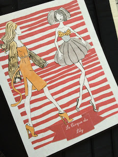
Last week, I wasn't able to post Sketchy Sunday. Therefore, this week, I've decided that I'd make a larger collection in order to make up for last Sunday. This is the largest collection I've ever drawn so far. I hope you enjoy my Circus inspired collection called "Le Cirque du Lily."


Monday, July 23, 2012

Teen Choice Awards Red Carpet Favorites

Taylor Swift in Maria Lucia Hohan
Lea Michele in Atelier Versace
Zooey Deschanel in Monique Lhullier
Demi Lovato in Falguni & Shane
Jordin Sparks
Kristen Stewart in Roberto Cavalli
Tia & Tamera Mowry
Carly Rae Jepsen in Lisa Ho
Kat Graham
Nina Dobrev in J. Mendel

Project Runway Recap & Review Week 1

As most of you may know, Project Runway Season 10 premiered this past Thursday, July 19th. The season kicks off with Project Runway's 10th Anniversary Party in Times Square in which the designers present their first challenge looks. The designers' first challenge was to take one of their previously made designs, an original look, and create a companion look to go along with it.


The winner of this challenge: Christopher Palu. His original look was incredible and the detail of it was magnificent. The color of the fabric is rich and gorgeous. I love how he executed this layered look. It gives dimension, texture, and flows beautifully. Christopher's companion look is also quite beautiful in my opinion. It's not as spectacular as the original look but, it is well constructed and fits well considering that he had to take it in about two inches because his model is incredibly thin.


The first designer to go: Beatrice Guapo. Her love for knit fabrics and lack of skill in sewing is what set her back in this competition. Although parts were well contructed, both looks were made from knit fabrics. Her original look consisted of a fur cape/pancho with a tribal-looking print. The dress was very bland although I did love the sheer bit on the shoulder. The companion look tied in well with the original but the top was super slouchy and looked like she cut holes out of a red pillow case. The construction of the skirt was nice but again, she could have made a better textile choice.

Some of my other favorites during this challenge:

Ven's original look is beautiful and looks effortless. His companion look was also very pretty and went perfectly along with the original, but the construction of the top is poor in my opinion. The seaming along the breast looks lopsided and uneven, as well as crinkly. It's not sharp. On the other hand, the skirt portion is very well done and resembles the floral aspect of the original. Hopefully Ven shows us more versatility throughout the competition.


Melissa's looks are very dark and mysterious which I love! Her construction is very sharp and crisp. The jacket on the original look is to die for and the asymmetrical dress is elegant with a goth twist. I would keep an eye on her during the competition as her skills and execution seem to be flawless.


Alicia's looks were very put together. The romper, although I don't like rompers in general, was done the right way, unlike many of the childish baggy rompers we see today. The top portion is semi-formfitting showing off the model's body in the right places. Her companion look, paired perfectly with the original, is well constructed. It is not sloppy; it looks as if she meant for the pants to be that way and I do like the look of the low-rise in-seam.


I favored Andrea's companion look over her original look, although that was nice as well. The shape of it may not be so functional but it is fun. The back is incredibly adorable as the bow is a nice touch. I also love the color scheme and stripe effect.

Stay tuned for this week's episode on Thursday, July 26, 2012. The designers are given the Unconventional Challenge!

Saturday, July 21, 2012

The Start of Lily and Making One of My Designs for the First Time

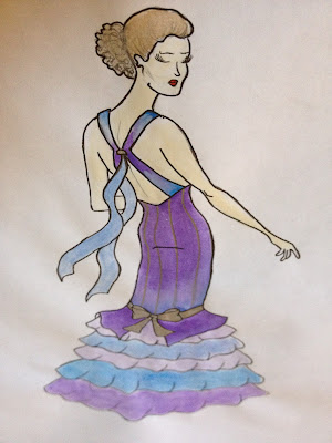
My dream, ever since I was little, was to become a fashion designer and have my own clothing line. Speaking of my clothing line, I chose the name and created the logo back in May of this year. As far as my designs, I would always scribble designs in my notebooks during class, they were a mess but I still loved doing it (It was much better than paying attention in class, thats for sure). As I got older, I became interested in learning more about sketching, which I did. Recently, I've been reading and learning more about the sewing aspect of design so in turn, I decided to make one of the outfits from one of the collections I drew during the Fall. The collection is Mermaid inspired and features aquas, golds, silvers, and greens. It's my first time making an outfit and while I'm trying to stick to my original sketch as much as possible, I have made changes as you will notice. Keep in mind, this outfit is still in progress and hopefully I'll be able to complete it soon. (My sewing machine is under going some technical difficulties). The final result, along with the portfolio photoshoot photos, will be posted once they are completed. I look forward to creating more in the near future and sharing them with you all.


My Original Sketch


Saturday, July 14, 2012

Are you High or Low?

One trend that has recently caught my eye in these last few weeks are the high/low hemline dresses and skirts. They are an effortless way to look chic, feel comfortable, and show a little leg. As I was in New York City last month to see a Broadway show, I passed by a woman wearing a beautiful nude colored high/low hem dress. The back of it was low-cut and it had criss-cross strapping. Needless to say, it was truly gorgeous and I fell in love with this style dress from that moment. Find styles like the ones below at the following links and get your high/low on today!

Forever 21 - High-Low Wrap Dress
Forever 21 - High-Low Racerback Dress
Charlotte Russe - Belted Floral Print High-Low Dress
Avenue - Faux Wrap High-Low Dress

Sunday, July 1, 2012